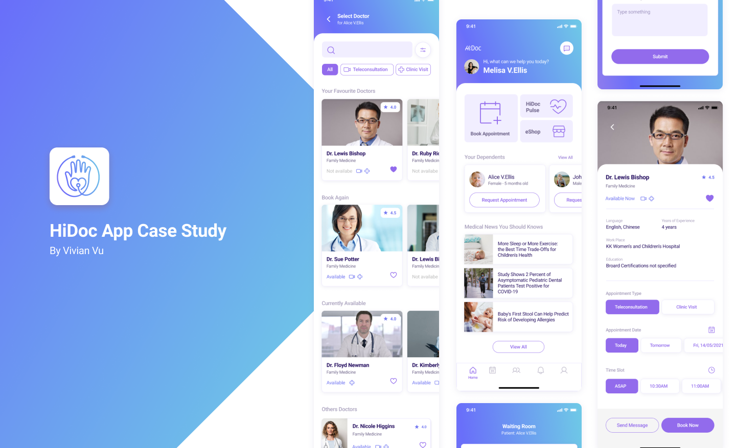
HiDoc is the virtual consultation with doctors app in Singapore. The company aims to empower people to get health care easier and insights to help them have a healthy life.
The challenge was to redesign the application for parents who have small child, and a user-friendly for doctors to contact their patients.
The outcome of the redesign was that both parents and doctors who used the tool felt that they had more control in taking care of people around them and trust HiDoc.
Problems:
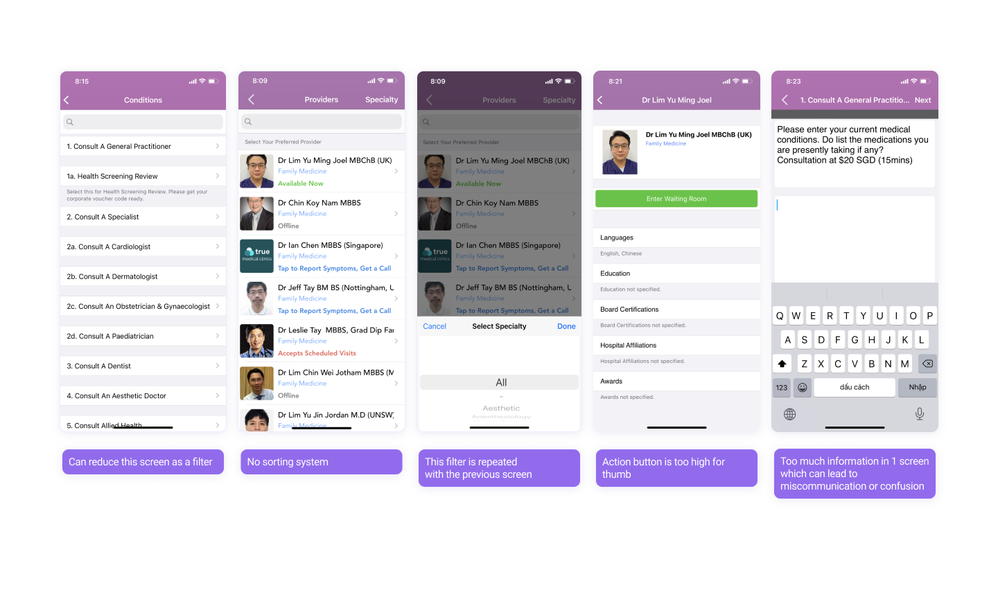
1. Takes too many steps to book a teleconsultation.
1. Takes too many steps to book a teleconsultation.
Based on my research on the current app, there are too many unnecessary steps. The moment I got to the "Add record" screen I have an urge to give up. So imagine parents have a small child, I'm pretty sure they will drop and find another app

Problems:
2. Current product struggled with several usability issues.
2. Current product struggled with several usability issues.
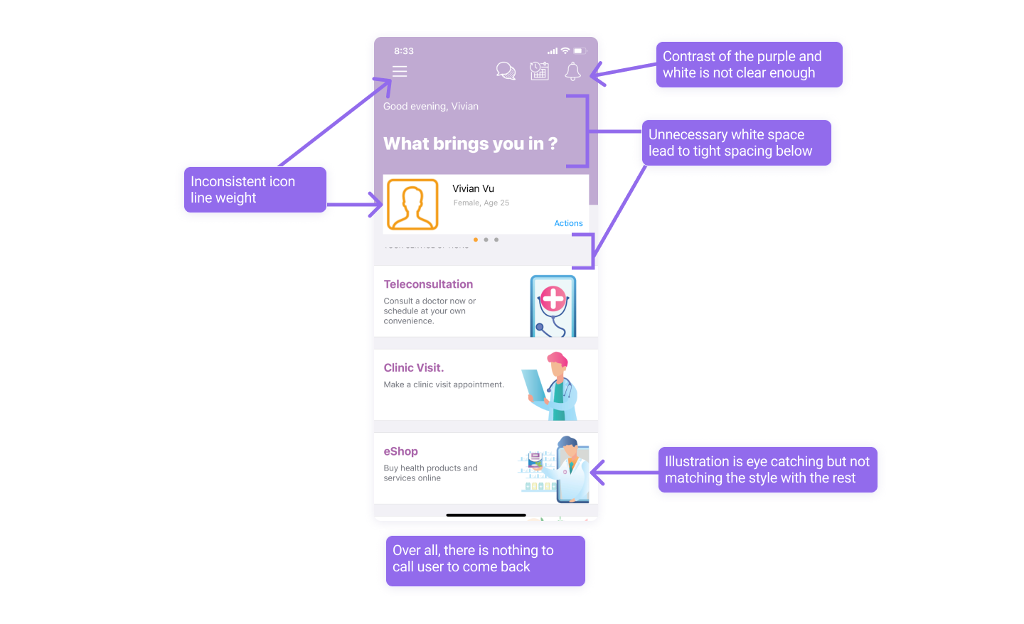
There are so many little things on the UI screen design that made the user feel uncomfortable. For example the doctor detail's screen, booking button is too high for the user's thumb.
Problems:
3. Design is not consistent and not eye-catching enough to the new generation.
3. Design is not consistent and not eye-catching enough to the new generation.
The whole look and feel of the app are outdated, which is a loss. If there are any similar app in the market and their styling is more attractive? I'm pretty sure the user will go with the other one.
Problems:
4. Some solutions are not suitable to main user
4. Some solutions are not suitable to main user
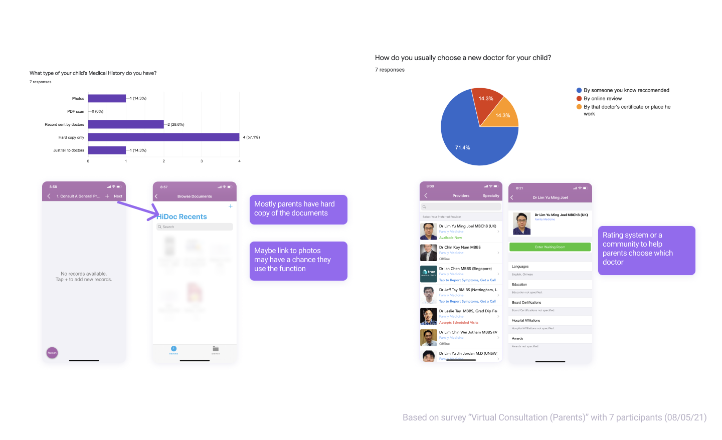
Based on the survey "Virtual consultation (parents)" - 08/05/21, that I did and have 7 participants, most of the parents don't have soft copies of the medical documents. However the current app requires adding documents to the documents, I think it would be better if it direct to photos or camera because at least they can take some photos from the hard copy.
Moreover, most of the parents agreed that they only bring their child to the new doctor based on someone they know. So maybe in the future, they can add on a "Community" feature so that parents can get to know each other and have a chance to expose other good doctors.
Design:
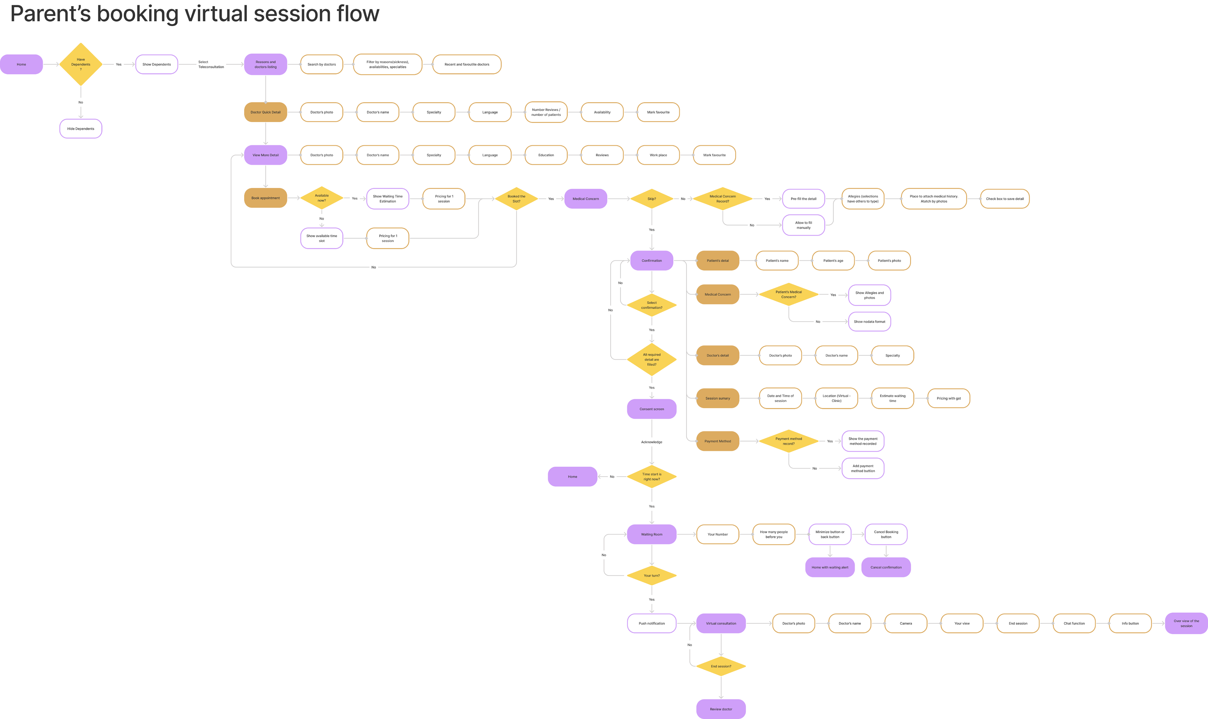
Main user flow
Main user flow
After gathering enough data, went back and improving user flow as well as the architect information

Design:
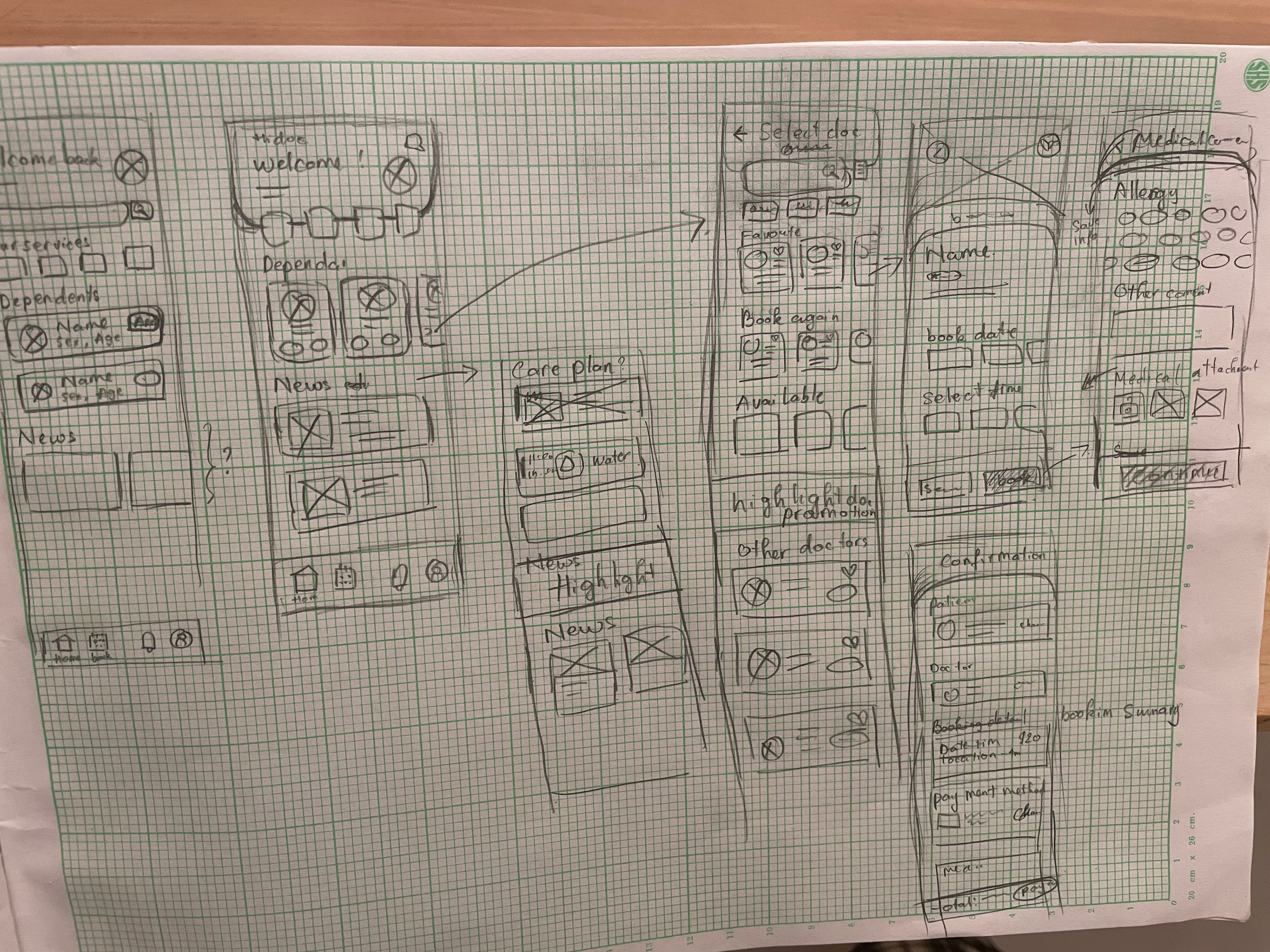
UI low fidelity
UI low fidelity
From the user flow and architect information that I did, I started to put all the pieces together by making a quick drawing to make sure everything looks right.
Design:
UI high fidelity
UI high fidelity
Times to make everything into reality.
Check out the prototype here
https://www.figma.com/proto/M9G54bd2jaKZDsfGPLHlyQ/HiDoc?page-id=0%3A1&node-id=4%3A2&viewport=344%2C238%2C0.18372566998004913&scaling=scale-down
https://www.figma.com/proto/M9G54bd2jaKZDsfGPLHlyQ/HiDoc?page-id=0%3A1&node-id=4%3A2&viewport=344%2C238%2C0.18372566998004913&scaling=scale-down